![analog_presentation.jpg](https://images.squarespace-cdn.com/content/v1/5d0407add4d9fb0001e7b572/1560967022061-CKK7G2YK1RSCG8YTBJ5A/analog_presentation.jpg)
![analog_presentation2.jpg](https://images.squarespace-cdn.com/content/v1/5d0407add4d9fb0001e7b572/1560967039634-Y7E1PLZZINHSUPU4M77D/analog_presentation2.jpg)
![analog_presentation3.jpg](https://images.squarespace-cdn.com/content/v1/5d0407add4d9fb0001e7b572/1560967084795-V36V0AXWXVHUU9T81G60/analog_presentation3.jpg)
![analog_presentation4.jpg](https://images.squarespace-cdn.com/content/v1/5d0407add4d9fb0001e7b572/1560967084748-YY8XT0Q9CDEANN8VTZGP/analog_presentation4.jpg)
![analog_presentation5.jpg](https://images.squarespace-cdn.com/content/v1/5d0407add4d9fb0001e7b572/1560967109180-0K3GJOR85WVE0D1VKA3P/analog_presentation5.jpg)
![analog_presentation6.jpg](https://images.squarespace-cdn.com/content/v1/5d0407add4d9fb0001e7b572/1560967109318-QU2VRD4WQL7D08DEGQHJ/analog_presentation6.jpg)
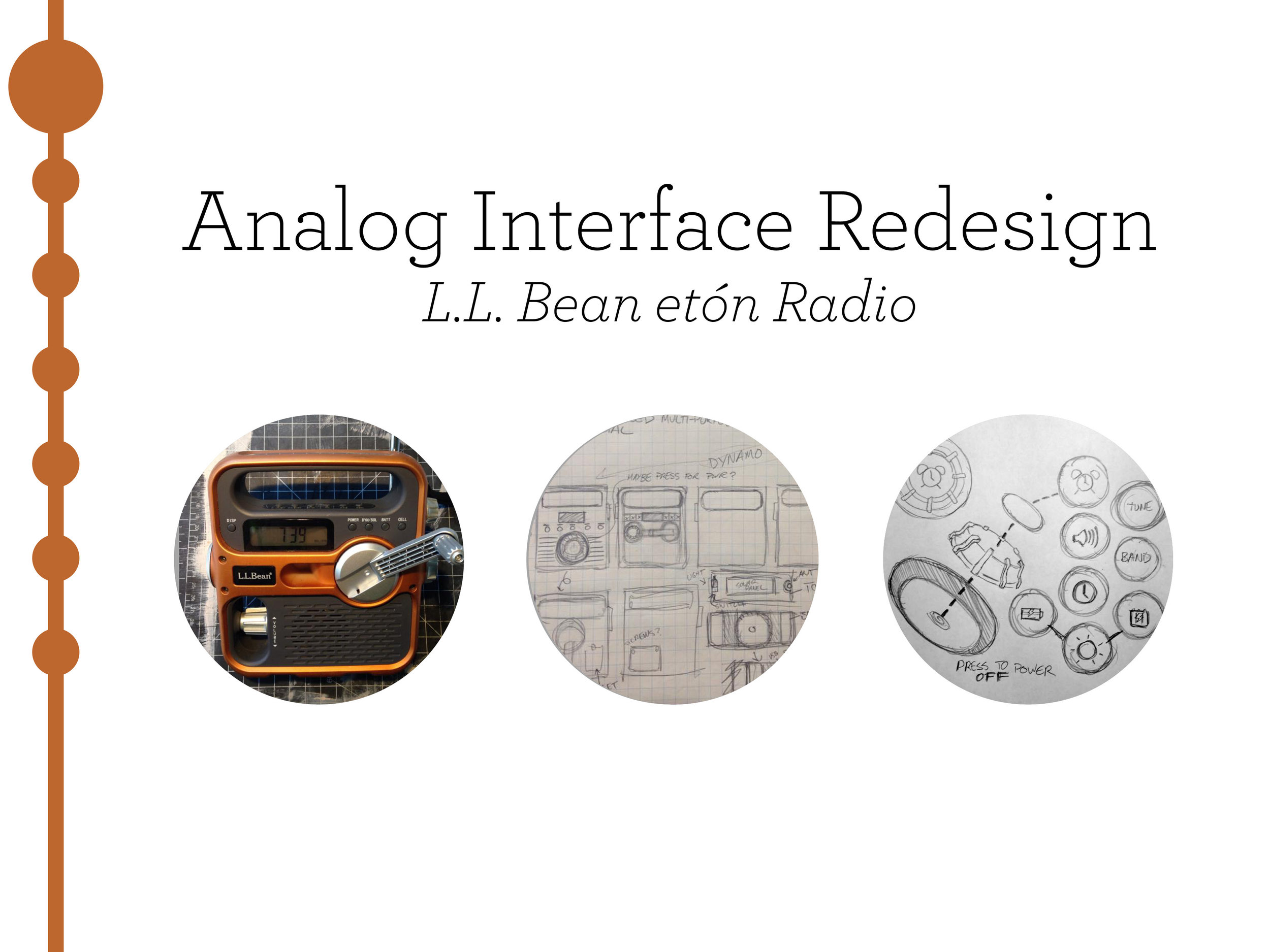
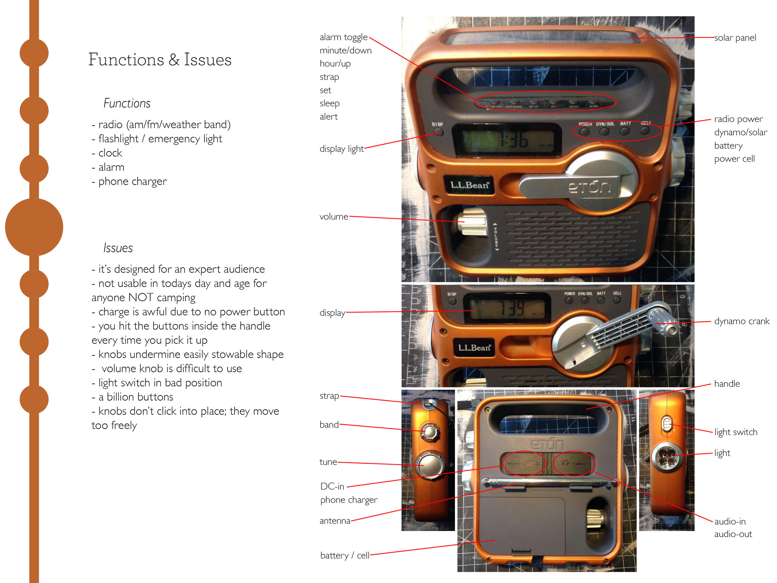
I’m pretty big on camping, and a staple of my trips for years was this old L.L. Bean etón radio. It technically has all the features you need (and more), but it’s really inconveniently laid out in terms of functionality. I love the thing, but I really wish more attention had been paid to the physical user experience here.
I believe an important part of understanding how to design for UI/UX is understanding how an analog interface works, and this thing desperately needed a redesign. It had way too many buttons, and the layout was clunky and extremely inconvenient (you couldn't use the handle without accidentally pressing every button hidden under it).
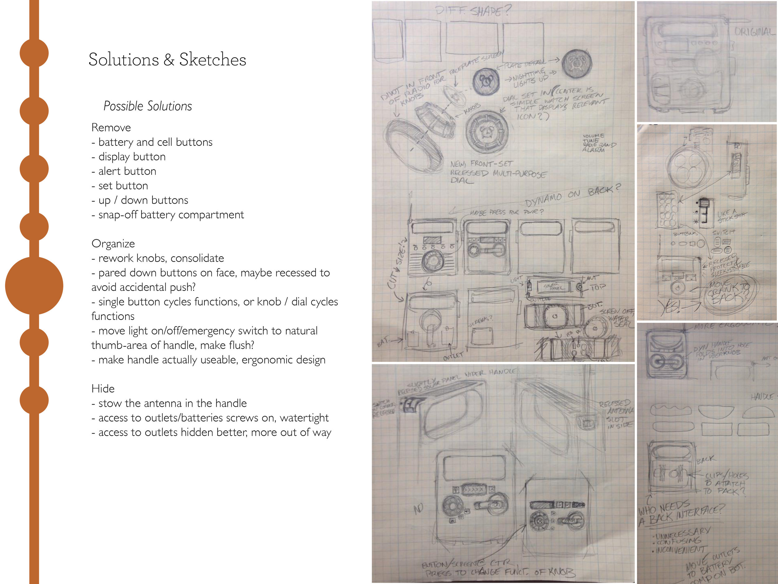
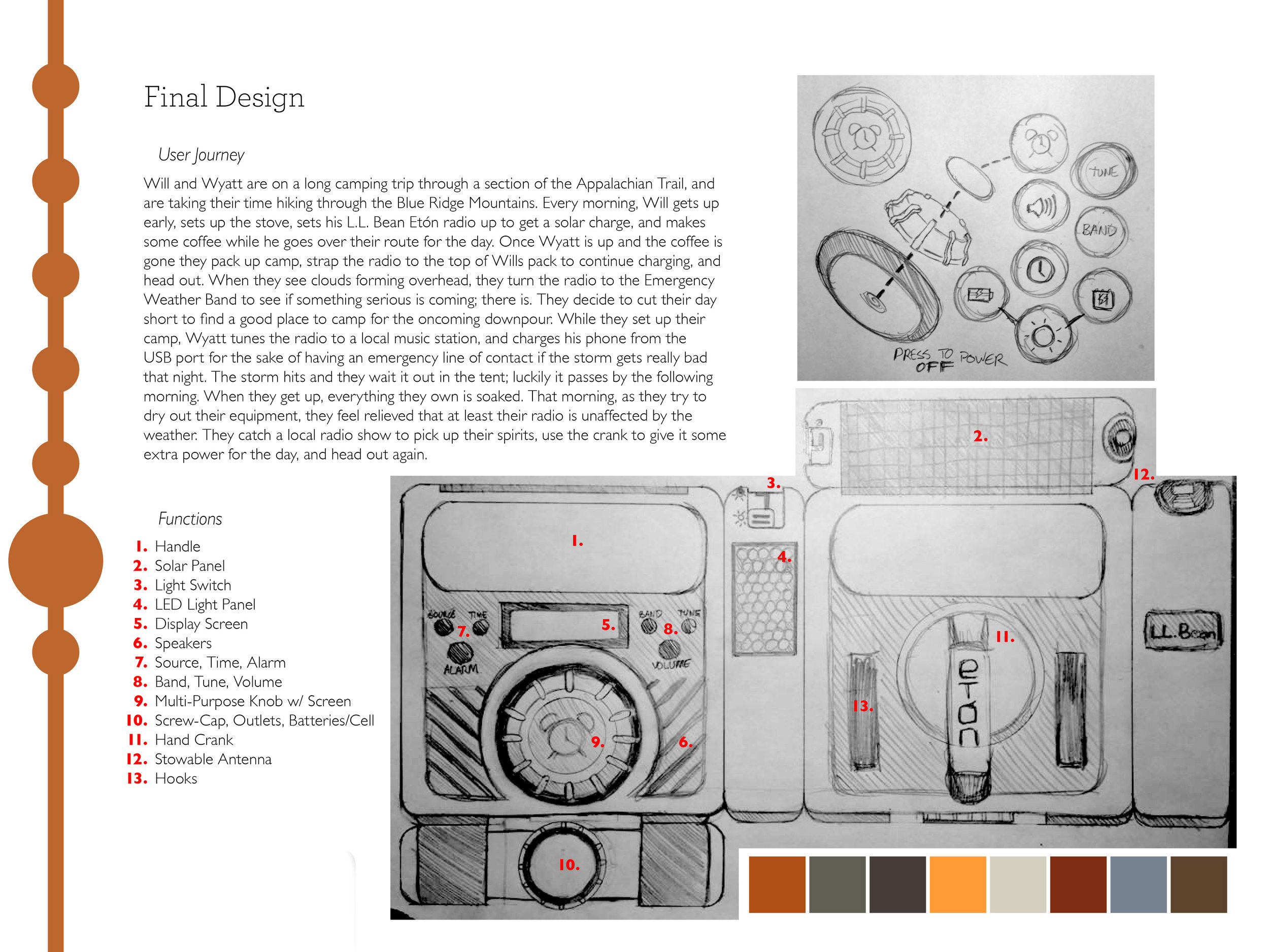
The following is a case study exploring an in-depth analog redesign of my favorite camping radio: